Following our presentation, our group will need to consider further how to make sure that our stall will be structurally sound and start collecting additional cardboard to create our tree.
We will also need to look into the cheapest place we can purchase the materials for our Packaging.
Thursday, 24 September 2015
Presentation and Brand Overview


Brand Overview
Our brand has taken on a very natural environmental feel, with our brand name as "Umber" which is a natural reddish brown colour. The colour scheme is made up of different shades of umber and a shade of green, with the logo made up of these colours and incorporating a tree which links back to the environment and the 3 of our 4 different products that will be made of wood.
Thursday, 17 September 2015
The Whole Concept
Aesop
The Aesop brand has a very sophisticated feel, conveying quality and value. Using very natural materials, colours and shapes throughout the different components of the brand. The main colours used throughout the packaging is browns, black and white, creating a very neutral sophisticated colour scheme. The Packaging itself is very classy, using glass bottles for the product with cardboard boxes for protection. The Displays a very creative and unique adding to the overall luxurious look.
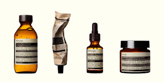

The brand conveys a message of sophistication, luxury and quality, which is what the customer is paying for, a well researched, refined and upmarket product that not everyone can afford.


The Aesop stores and displays are made up of a lot of timber, which continues well with their natural colour scheme and atmosphere. Lighting also adds to the natural relaxed atmosphere, enhancing the luxurious feel and contrasting with the lower market companies and stores.
References
http://www.aesop.com/au/
http://www.dezeen.com/tag/aesop/
Thursday, 3 September 2015
Group Mood Board
Group Mood Board

Target Audience
Our stalls target audience is females aged 18-45 as our products are more feminine and would likely be purchased by females or for females as gifts.
"Brand Feel"
The brand feel we are looking to achieve is a relaxed, nature-inspired atmosphere. Linked deeply to the environment with our choice of colours, display and brand name.
Thursday, 27 August 2015
Retail Display Research
Products in supermarkets are displayed in various groups throughout the store, predominantly displayed on shelves that make up aisles throughout the store. With the fresh produce arranged in open crate like shelving, taking up a lot of shop space within the store and frozen and cold products stored in fridges and freezers around edges of the store.

The layout of supermarkets is very similar across the different stores, with products split up into different categories such, fresh fruit and vegetables, meat, seafood, dairy, frozen, pantry etc. so that people can easily find what it is they are looking for.
The Products displayed in a supermarket are often displayed to convey freshness, with the fresh produce taking up a lot of the shop space, with the products displayed together so that customers can see the range of produce available and the bright colours catch their eye. They are also there to be picked up and examined, meaning you can check the product before purchasing as there is no packaging in the way.

New and on sale products are often placed at the end of the aisles and the front of the stores so that they are easy to see and encourage impulse buys at the registers. High turnover products are frequently placed at eye level so that they a more likely to be seen, these products a typically products that people buy on impulse.
Supermarkets and brands use signage as visual clues and attention grabbers for products, for example, signage in Woolworths is often green, which presents ideas of freshness and growth. Sale signage is often bright colours which catch customers attention and new products often have signage with big eye-catching typefaces.

References
https://www.coles.com.au/
http://www.woolworths.com.au/wps/wcm/connect/webSite/Woolworths/
Monday, 24 August 2015
T2 tea vs. Lipton's tea
T2
T2's primary colours are orange, black and white, with bright colours used to differentiate the many different flavours of tea available. These colours are very good at catching your attention and contrast with the black to give a sophisticated feel to the store.

T2 uses the sans serif font Arial bold in their branding and logo which gives the brand a young modern feel. With the Lack of serif's making the typeface less formal and easy going, which is also enhanced by the stores low lighting and cosy atmosphere.

T2 uses mostly cardboard and plastic wrap in their packaging, with the plastic wrap that in some cases reseals, helping keep the product fresh. Paper bags are used for their carry bags. T2's packaging shows its quality as it helps to preserve the product being purchased. Their packaging is also connected to user experience as the customer is able to open the box to see the product through the plastic wrapping, experiencing more of the product before purchasing.

Lipton
Lipton's main colours used in their branding and logo is yellow and red, with variations in the colour of the packaging to differentiate the different flavours of the tea. Though used to a lesser extent than T2 with the differences not quite as obvious as they use graphics as well to separate the flavours.

Lipton also uses a san serif font, Arial Regular for their branding and logo, which gives off a more relaxed feel than a serif font. The use of the Arial Regular typeface links Lipton to the many other brands that fall under the Unilever Company, making the brand and product less unique.
The materials used for the packaging of Lipton tea products is a cardboard box with plastic wrap around it to stop consumers from opening the box before purchasing, unlike T2, making purchasing Lipton products less of an experience, with customers aware of exactly what they are purchasing, whereas T2 customers have their favourite flavours but are also encouraged to try new products whether by tasting, seeing and smelling them.


Comparison
Customers of T2 are paying for the quality of the products as well as the overall experience, whereas Lipton customers are going for a lower quality more familiar product.
References
http://www.t2tea.com/
http://www.lipton.com.au/
https://www.unilever.com/brands/
https://www.unilever.com/brands/
Product Mood Board

Retail Brand Research: Smiggle
Smiggle was started in 2003, opening their first store in Melbourne. Later spreading across Australia and then over to New Zealand, Singapore and UK. Smiggle joined the Just Group in 2007, with their goal to become the world's most exciting and famous stationary brand, inspiring and developing the creative spirits of their young customers.

They aim is to deliver original, fun, affordable stationery which they achieve by using bold colours, quirky graphics, with bright inviting stores enticing people in. Their intention to blur the lines between education and fun.

This is achieved as their target market is Kids and Tweens, who are drawn to the bright colours, quirky products and clever designs. With their parents attracted to the products that inspire their kids to create and learn. The stores are inviting and encourage the kids to test and play with the products available.

Smiggle's packaging is primarily cardboard and plastic with the use of paper bags for carrying customers purchases. Which have their logo on the front that signifies the creative tools and fun inside. Smiggle aiming to keep the packaging to a minimum so they remain as environmentally friendly as possible and so that the store is as hands on as possible, giving the shoppers a chance to use and play with the products before purchasing.

References
http://www.smiggle.com.au/shop/en/smiggle/about-us
http://www.justgroup.com.au/pdf/AustralianPackagingCovenantActionPlan.pdf
http://www.trulydeeply.com.au/madly/2012/10/17/smiggle-the-aussie-brand-that-is-laughing-while-other-retailers-scratch-their-heads/
Subscribe to:
Comments (Atom)